ShipSense — IoT Cargo Monitoring
Real-time cargo monitoring, designed for managers on the move.
What it solves
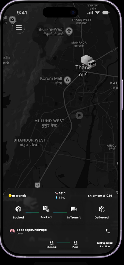
Logistics managers struggle with fragmented data and delayed notifications about cargo conditions — temperature, humidity, location. By the time a problem reaches the manager, the cargo may already be compromised. ShipSense centralizes real-time IoT sensor data into a single intuitive dashboard so issues surface immediately and the team can respond before loss occurs.
Key design decisions
Status-driven dashboard
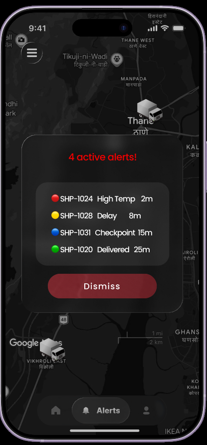
Prioritized a Critical Alerts section at the top of the home screen so high-priority issues like temperature spikes are the first thing the user sees — no hunting through menus when seconds matter.
Modular tracking cards
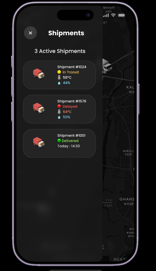
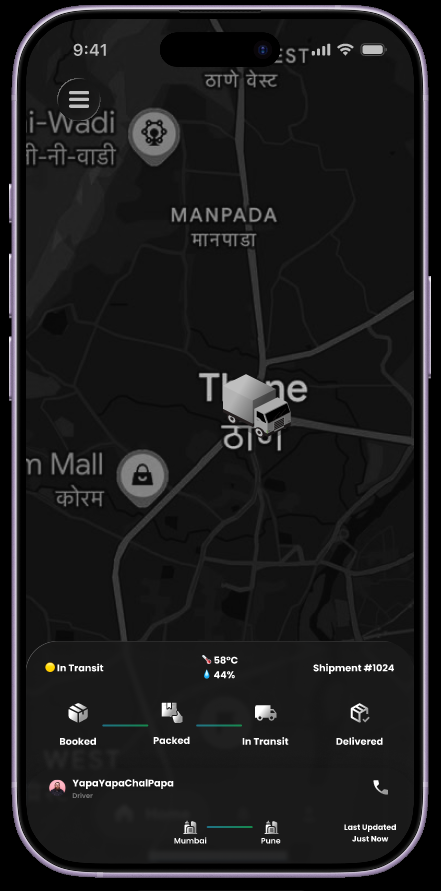
Each shipment gets a compact card with the essentials — ETA, current location, status, temperature, humidity — to reduce cognitive load while keeping the most relevant data visible.
Data visualization
Used clean, color-coded indicators for sensor data so users can spot trends and anomalies at a glance, without parsing raw data logs.
Inside the prototype
What shipped
Developed a high-fidelity interactive prototype with a complete end-to-end tracking flow. The design focuses on zero-latency information retrieval for fast-paced logistics environments — every screen is built around the principle that the user should never have to dig for critical information.
What I learned
Complexity vs. clarity
Learned how to balance high-density technical data with a clean UI by using progressive disclosure — show summary first, full data on tap.
Designing for the field
Realized that field users (warehouses, on-the-go) need high-contrast buttons and large tap targets — accessibility under glove, glare, and motion.